Parts I, II, III, IV, V and VI.
Onwards down the SPIRAL of comic book creation.
We’ve gone from idea and concept to outline and script, to finding the right artist and working on the visuals of the story. Now it’s time to look at some actual pages of Spiral. From script to thumbs. Pencils to colour. Then the final touches with lettering.
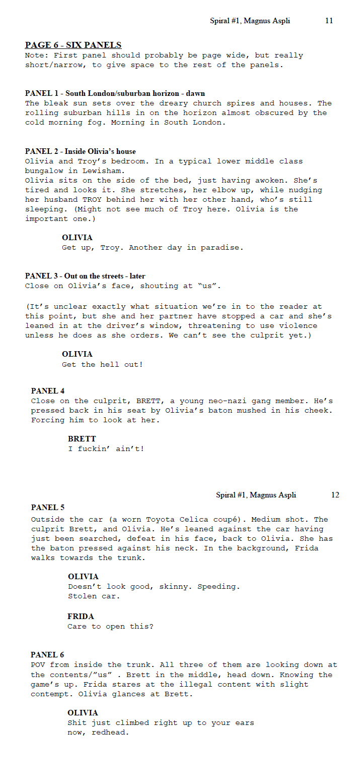
Here is the script for page 6.

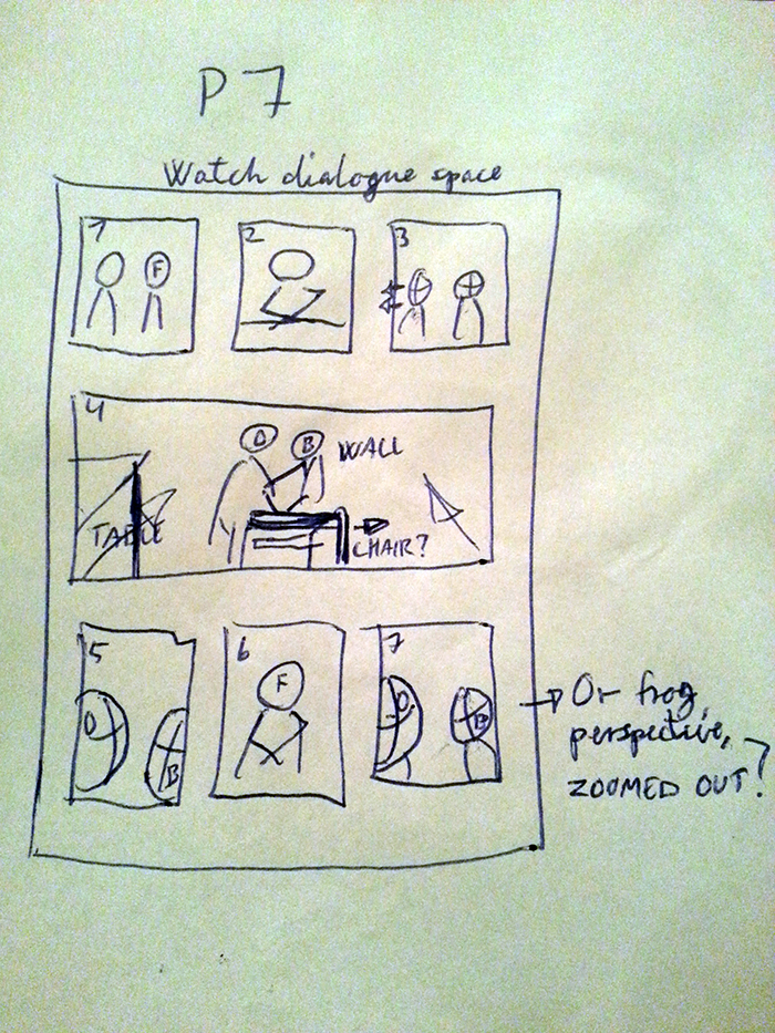
My layout suggestion.
I supplied Emerson with a stick-figure layout of how I saw the page. I make these for myself to better see how the script works, but they can come in handy for your artist when he/she interprets your script. Just make sure you ask first and don’t throw this along as some guide book. That’s insulting. Also, it’s important to mention that they are just suggestions. A good artist’s mind is more visual and knows the in-and-outs of the pace and storytelling of a page, so let him/her do their part.
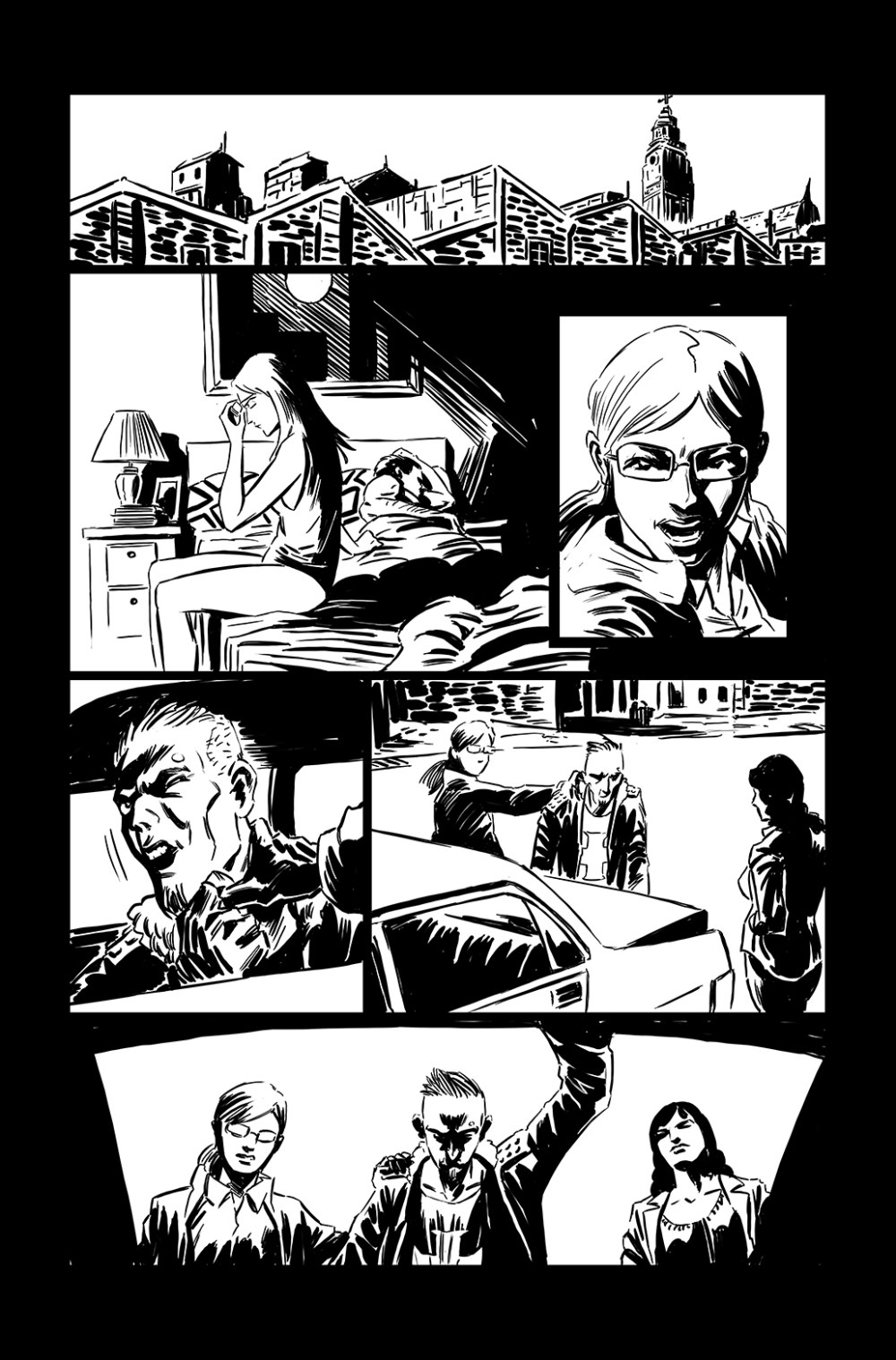
Another good example why Emerson is a great artist to work with was his suggestion to remove the baton. Olivia’s already shown signs of bad temper and violence earlier, and it doesn’t need to be emphasized here. Which is brilliant feedback that makes the story better. Writers should always be open to listen to feedback from their artist(s), not just their writer peers. It’ll usually make the story a lot better. Again, this solidifies the fact this is a collaboration, where SPIRAL becomes OUR comic book/story, not just mine. The emotional bond, just like I talked about earlier.

Emerson, layouts
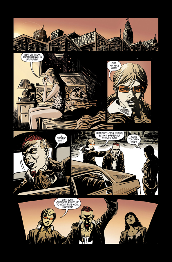
With a few very minor tweaks, Emerson nailed the layout on the first attempt. (My suggested layout above proved to be nearly right in terms of flow and pacing. Sometimes we writers get it right too!) The evidence of me making the right decision about choosing Emerson are piling up. Great flowing page, and even with the intentional jarring jump of scenes after the second panel, it reads really well. Notice how the inset panel of Olivia floats between two different times. How the glasses link it back to panel 2 and how her angry behaviour links it to panel 4.
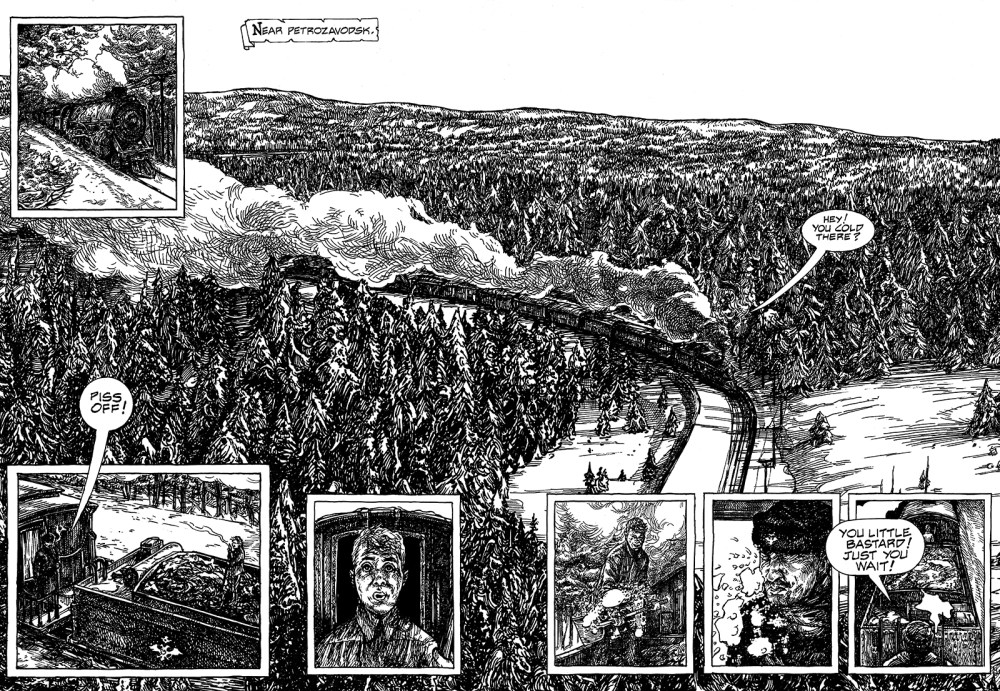
Inks. Showing how perfect Emerson’s rough and organic style is for the story and genre. Include lettering, and this could have been a final page. Both the story and the artwork works nicely in b/w. But since Emerson is extra brilliant, he does colouring too.

Initial colours by Emerson.
These were the original colour choice, which we stuck with throughout all the pitch pages (7 pages) at first. After we saw the pages all together we decided to try a more moody approach. Although the sparse but diverse and clean colour choices here work, we felt we didn’t capture a real identity with the pages this way.

With a unison, more muted choice of colours, we knew we’d captured the real mood of SPIRAL.
Let’s look at page 7.
A very dialogue-heavy page, which I remind Emerson of in the layout suggestion.

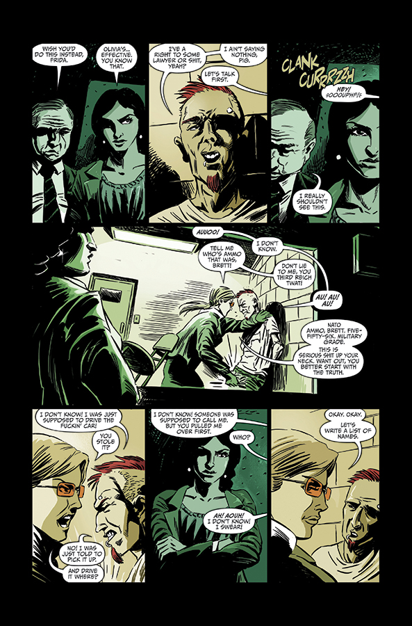
Layouts by Emerson.
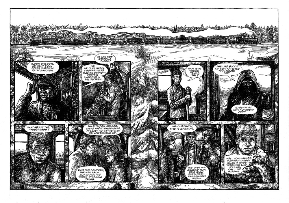
Again, Emerson takes a similar approach, but notice the different body language with the heads, which really sells the layout. Also, that big panel is made perfect by joining the two locations together. In the script this is obvious, but on a page it doesn’t necessarily explain itself. By using Frida and the back room as the frame for the interrogation room in that big panel, Emerson brought it all together.

Inks.

Original colours.
Like mentioned previously, we adjusted the original colours for something with more identity.

New colours. With shine.
The theme of yellow versus green was kept, but everything is muted and feels more in harmony. This was the first test, where Emerson added some shine effects.

Final colour choice.
Same muted colours, but without the shine effect. This was the page we went with, and the style of colours that we decided to run through all pages.
Emerson’s brilliance was now done. From layouts to colours. It was time to bring in the unseen force of comics creation. The letterer. I myself can letter, but very basic stuff, so I didn’t want to do injustice to Emerson and his art by slapping my mediocre skills on top of this.
Through my network I had a few suggestion for people to get in touch with. Although it’s the least thought of aspect of creating your comic, it’s also the aspect that shows if the project is good or not. Bad lettering sticks out like a sore thumb and can ruin the best of pages and stories. Simple advice: get/hire someone who can do it properly.
I got in touch with Crank! (Chris) and paid him to do the lettering for the initial pages of SPIRAL. And I was so pleased with the result, I hope we can have Crank! with us as we create all four issues.
Here’s how he made the finished pages look:
A lot of dialogue and balloons, but Crank! handled the page expertly.
Next time we’ll look at creating the cover and identity of Spiral, as we move into finishing up the pitch package. We’ll get to that too, so stay tuned.